Colour is at the heart of everything I create. It is more than a finishing touch or decorative element. In my atelier in Rotterdam, I use colour as a language to connect people, materials and stories. My work with colour in textiles is both intuitive and research-driven. Every surface I design begins with a colour story. Sometimes this story unfolds from a client brief, sometimes from my own research into cultural, social or ecological themes.
 |
| textiles and dye samples during my open atelier weekend |
Colour as Material
I treat colour not only as pigment but as material in itself. The way a colour interacts with texture, light and movement transforms its character. A deep blue on smooth silk reads very differently from the same blue on a matte wool or a woven jacquard. This sensitivity to surface and tactility is essential in my design work.
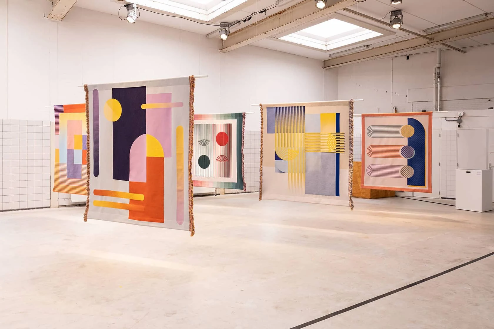
In projects like Chromarama, I explored how colour perception changes for people with colour blindness. Creating woven and embroidered textiles that remain accessible and visually rich for all audiences. Colour is never isolated. It lives in context, layered with materiality and meaning.
 |
| installation of Chromarama tapestries by Kukka |
My Colour Research Process
Working with colour in textiles often begins with hands-on experiments:
-
Yarn windings to test colour combinations
-
Dye tests on different fibres
-
Digital colour studies to explore harmony and contrast
-
Sampling with manufacturers to see how colours behave in production
My inspiration comes from everywhere, art, nature, architecture and everyday observations. A colour palette might emerge from a stained glass window, a shadow on the street or the layered hues of oxidised metal.
Conscious Colour Choices
As a designer working with textiles, I am aware of the environmental impact of colour. Dyeing and printing methods often rely on dyes with a heavy ecological footprint. That is why I experiment with natural dyeing, biobased pigments and bacteria-dyed textiles in projects like Living Colour, Analog Eco, Japanese knotweed and BInc Biogenic Ink.
Sustainable design is so often associated with muted palettes and toned-down aesthetics. But colour can be conscious and expressive. I explore ways to create vibrancy with respect for people, materials and the living world.
 |
| Living Colour bacterial dyed textiles |
My Approach in Practice
In client collaborations, I translate this colour sensitivity into bespoke surface designs tailored to the identity and values of each brand. Some projects call for custom prints. Others focus on developing material concepts or creating textiles for specific spaces. In each case, colour forms the foundation. It carries the story, enhances the material and guides the overall atmosphere of the design.
Each project brings new considerations:
-
How will the colours age over time
-
How does light transform the design
-
How does the material carry the colour
These questions shape my design process. Always balancing aesthetics with function and sustainability.
Explore My Work
Curious to see how I work with colour in practice?
Explore my portfolio of textile and surface designs.
Or download my Fabric Printing Checklist for practical tips on creating your own printed textiles.
Studio Notes
This article is part of Studio Notes on Colour & Materiality – a series from my atelier exploring colour, textiles and surface design. If you would like to receive new Studio Notes directly in your inbox, you can subscribe to my newsletter for occasional updates and colour stories from my Rotterdam atelier.


No comments
Post a Comment